Bison

Industry intelligence that matters

Tag: Private Equity Benchmarking

Buyout Returns Soar While Hedge Funds Underperform

by Michael Roth

Private equity is an alternative asset class but we view it as a subset of the broader equity asset class. It shares this commonality with hedge funds which have been in the news a lot over the last few years because of their dismal returns. No story was bigger than CalPERS’ decision to exit hedge funds 18 months ago. However, the decision was not too surprising when you take a step back and look at hedge fund returns in relation to other asset classes.

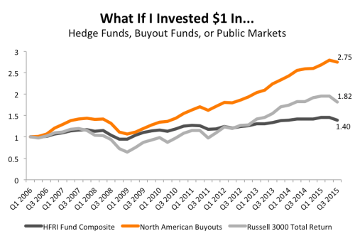
The chart below uses quarterly time-weighted returns to plot the growth of one dollar invested in three different buckets of the equity asset class since 2006.

HFRI vs Buyouts

From 2006 through Q3 2015, hedge funds have dramatically underperformed the North American buyout industry as well as the public markets. The chart above shows that $1 invested in the HFRI Fund Composite Index would have resulted in just $1.40 as of Q3 2015. That’s 49% lower than what $1 invested in the buyout industry would have generated as of Q3 2015.

Lower Risk Has Not Compensated for Lower Returns

Screen Shot 2016-03-29 at 8.44.52 AM

The hedge fund industry could try to make an argument that lower returns have been in exchange for lower volatility and risk. However, the difference between the standard deviation of the HFRI’s returns and North American buyouts’ returns is less than 100 basis points. This reduction in risk is not nearly enough to compensate for a 49% lower return over the last 9.5 years.

Wrapping Up

Buyout returns have dramatically outperformed their hedge fund brethren.  It’s a more complicated calculation that simply taking from one allocation and putting it into another but, given how stark the difference in returns has been, it’s surprising that we have not heard about a larger move out of hedge funds and into buyouts.

Digging In To Distributions: An Update on Venture Capital’s Issue

by Michael Roth

Last summer, I highlighted the glaring lack of distributions within the VC industry since the late 1990s. It’s been over six months since I published that piece so I wanted to provide an update on where things stand through June 30, 2015.

VC Funds Have Cashed Out Where They Could

Q2 2015 VC DPI and TVPI

Venture capital funds saw a strong distribution pace during the first half of 2015. Looking at the DPI:TVPI ratios, the 2003 – 2007 vintage years saw a noticeable increase – improving by 32% on average. Three of those vintage years jumped above 0.5 barrier which means the average fund has distributed more than half of its total value. As a reminder, the DPI:TVPI ratio is a measure of how much of a fund has been realized (a ratio of 1 means the fund is fully realized).

DPI Multiples Improved but Still Below 1.0x

DPI multiples are still struggling to reach 1.0x, which means the average fund since 1998 has yet to return 100% of what investors have paid in.

VC DPI Since 98
The two years that stick out are 2003 and 2010. These are the vintage years that saw the biggest increase in median DPI. 2003 sticks out because it is on the cusp of a 1.0x DPI multiple but 2010 actually saw a bigger increase, percentage-wise. Funds that drove the increase in 2010 include Union Square Ventures Opportunity Fund and Insight Venture Partners VII on the tech side and Third Rock Ventures II, Orbimed Private Investments IV, and MPM Bioventures V on the healthcare side. 

VC DPIs Lagging But TVPIs Not As Far Behind

My analysis of VC distributions so far has highlighted the positive developments. What can’t be ignored is that these positive developments have not occurred in a vacuum. The buyout industry’s DPI multiples also improved and are still higher than the venture capital industry for 13 of the 15 vintage years from 1998 through 2012.

Buyout vs. Venture

While the DPI multiples have clearly been lagging, venture capital’s median TVPI multiples have shown strength over recent vintage years. The big question is whether these TVPI multiples are real or is it a matter of time before they come back to reality. 

Final Thoughts

Venture Capital had a solid two quarters to start off 2015 but the DPI issue still remains. Since the industry is prone to large valuation fluctuations, the ability to cash out when times are good is an important part of being successful. This analysis is also important because investors need to analyze and decide whether an allocation to venture capital is worth the risk.

While DPI multiples have increased across nearly every vintage year, the DPI:TVPI ratio is still lower than that of the buyout industry for all but one vintage year since 2000. This means LPs remain highly exposed if this current cooling off phase accelerates into a bigger decline.

Venture Capital Continues its Hot Streak

by Michael Roth

Bison’s June 30, 2015 final benchmarks were published last week. Using our cash flow dataset (“Bison funds”), we are able to analyze close to 1,300 North American private equity funds and identify industry trends.

Horizon IRR

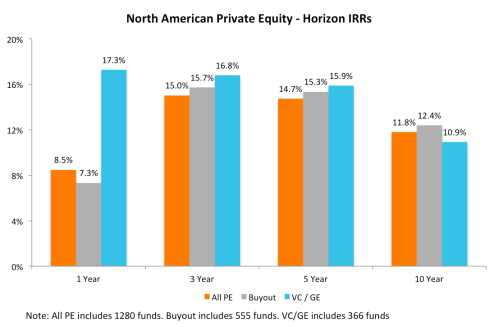
The chart below illustrates the 1, 3, 5, and 10-year horizon IRRs for North American All PE, Buyouts, and Venture Capital / Growth Equity.

Q2 2015 Horizon IRRs

For the second consecutive quarter, the venture capital industry has a higher IRR over the 1, 3, and 5-year periods than the buyout industry. VC is still lagging buyouts on the 10-year horizon but it has narrowed the gap by 100 basis points over the last two quarters.

Time-Weighted Returns

The chart below looks at the returns for private equity and the public markets using an apples-to-apples time-weighted methodology.

Q2 2015 TWRR

Over the short-term and long-term, private equity is outperforming the public markets, represented here by the Russell 2000 and Russell 3000 total return indices. Similar to the horizon IRRs, venture capital is outperforming buyouts over the 1, 3, and 5-year periods. Over the 10-year period, buyouts are still outperforming venture capital by more than 200 basis points. Looking at the medium-term (3 and 5-year horizons), the public markets are outperforming through June 30, 2015. It will be interesting to see how these numbers hold up as of Q3 and Q4 2015.

Investment Activity

Investors are surely happy with the strong returns but they must also be pleased that GPs were busy selling assets and locking in gains. The chart below illustrates the ratio of distributions to contributions during each of the last four quarters. A ratio greater than 1.0 means there were more distributions than contributions in the quarter.

Dist vs. Calls

Both the venture capital and buyout industries saw their Distributions/ Contributions ratios jump in Q2 2015. Given how tumultuous the public markets were during the second half of 2015, it will be interesting to see how this ratio changes in Q3 and Q4. The surge in distributions is also notable for the VC industry because the inability to return money to investors has been an issue that I have highlighted before.


How Do GPs Calculate Net Asset Value?

by Michael Roth

For funds that are not fully exited, the net asset value (“NAV “) is the primary component of its total value. This means the NAV plays a critical role in determining a fund’s performance metrics (TVPI multiple and IRR). It is the sum of each portfolio company’s NAV and these values are determined by the GP. As a result, it is important to understand how a GP values their portfolio companies and the accounting standards that guide this process.

At the gross cash flow level, this includes the value of the GP’s equity ownership stake in each portfolio company that has not been sold. At the net cash flow level, this includes: (1) the value of the GP’s equity ownership stake in each portfolio company that has not been sold and (2) the amount of carried interest that has been accrued by the manager given the fund’s current value.

Technically speaking there is a hierarchy, broken up into three levels, that GPs must follow when they value companies. The hierarchy below has been paraphrased from the FASB’s “Fair Value Measurements and Disclosures (Topic 820)”:

Level 1 –  Investments must be valued using objective, observable, unadjusted quoted market prices for identical investments in active markets on the measurement date, if available.

Level 2

  1. Objective, observable quoted market prices for similar investments in active markets.
  2. Quoted prices for identical or similar investments in markets that are not active.
  3. Inputs other than quoted prices that are observable for the asset.
  4. Inputs that are derived principally from or corroborated by observable market data by correlation or other means.

Level 3 – Subjective unobservable inputs for the investment where markets are not active at the measurement date. Unobservable inputs reflect the firm’s own assumptions about the assumptions that market participants would use in pricing the investment and should be developed based on best information available under the circumstances. The entity’s own data shall be adjusted if information is reasonably available without undue cost and effort that indicates that market participants would use different assumptions.

In short, the majority of private equity portfolio companies are considered “Level 3” assets because they are illiquid assets that are only valued on a quarterly basis. As a result, companies can be valued by using a combination of factors that are ultimately subject to the GP’s discretion. The exception to this “rule” is when a GP exits a company via the public markets and holds publicly listed stock. Those assets will be “Level 1” assets.

A Deeper Dive into Level 3 Assets

Since there is considerable leeway with valuing Level 3 assets, I will discuss the most common methodologies used by GPs: industry comparables, precedent transactions, and the discounted cash flow (“DCF”) method.

Industry Comparables Method

The industry comparables method seeks to find publicly listed companies whose business operations either fully or partially match the business operations of the company being evaluated. Comparable companies are initially filtered by geography and sector. From there, GPs will look to narrow down the peer set further using either revenue, EBITDA or enterprise value (“EV”) metrics. For example, if I am valuing a company with an EV of $300 million, it is more appropriate to compare it to companies of a similar size rather than a company that has an EV of $4 billion.

Once GPs have a comp set, they will find the average EV/EBITDA multiple and use that multiple as the basis for valuing their company. Depending on company metrics, GPs may make adjustments to the multiple higher or lower. Factors that could impact this include higher (or lower) historical revenue or EBITDA growth, higher (or lower) forecasted revenue or EBITDA growth,  higher (or lower) EBITDA margins, higher (or lower) debt levels, and company size relative to the comps. These are the most common factors and offer a sense of possible areas where subjectivity could come into play.

Precedent Transactions Method

Precedent transactions are recent acquisitions that have occurred of similar companies. GPs will use the valuation metrics (EV/EBITDA or EV/revenue) to value their companies. This data can be difficult to find and is often limited to transactions of public companies. The other common issue with this method is that valuation information is often stale because precedent transactions occurred several years earlier when market conditions were different. Generally speaking, precedent transactions that have occurred within in the last year are considered to be valid data points.

DCF Method

The discounted cash flow methodology uses a GP’s cash flow model to estimate the company’s value. This is the most subjective method and has a tendency to be viewed with skepticism whenever it is used. That is because you are relying on the GP’s estimates for a large number of inputs, including revenue growth, EBITDA growth, and EV/EBITDA multiples and the discount rate. A slight adjustment to any one of these factors could have a meaningful impact on a company’s valuation.

When a GP uses a DCF model to value a company, it is important to understand why they are doing this and what assumptions they are using. At Bison and from my prior fund of funds days, I have not seen a DCF model used by itself very often. Sometimes, a GP will use this alongside the industry comparables methodology. In this situation, they will assign a weighting (ex. 50/50 or 75/25) to the valuation generated by the industry comps method and the DCF method.

Wrapping Up

Knowing how a GP calculates the NAV helps inform your opinion about the validity of the fund’s performance metrics but it can also offers insights into the GP’s character – are they fair and honest; do they have a tendency to be aggressive; or maybe they are slow to adjust to a changing situation. From an LP perspective, make sure to ask the right questions – how and why are you valuing your companies in this way? From a GP’s perspective, make sure that you are consistent and transparent about your valuation process. Nothing raises red flags more than dramatically changing your methodology or shrouding your process in secrecy.
The Horizon IRR Metric Keeps Being Misused

by Michael Roth

Accurately measuring performance and estimating asset class returns is the most important part of the asset allocation process. The reason it is important is two-fold: (1) return estimates have the biggest impact on your asset allocation model and (2) studies have shown that asset allocation is a critical component of returns.

Considering this, industry trade groups, like the BVCA, and service providers, like Cambridge Associates, continue to inappropriately tout a horizon IRR calculation in comparison to the public market’s 1,3, 5, or 10 year time weighted rate of return.

As I have discussed previously, it is a mistake to think an IRR and a time weighted return are one and the same. Both are annualized rates of return but they deal with cash inflows and outflows in different ways. IRR specifically accounts for the timing and size of cash flows when calculating the returns generated while the time weighted return specifically excludes the impact of cash flows and weights the returns in each time period equally. Each method has their shortcomings and ideal use cases. Take these metrics out of context and they can be misleading.

What difference does a return calculation make?

I used a portfolio of 481 North America and Global buyout funds from Bison’s cash flow dataset to analyze the difference between the horizon IRR and the time weighted return. Both return calculations were performed using quarterly cash flows. Read the rest of this entry »

A PME Analysis of Private Equity

by Michael Roth

Before we move on to 2015, let’s take one final look at where private equity stands as of Q4 2014. Using our cash flow data, I compared the pooled net IRR for the 2000 through 2012 vintage years to the Bison PME for the Russell 2000®. I focused on North American and Global funds, where the Russell 2000 could be a relevant public market comp. Funds in this analysis account for close to $1 trillion of committed capital.

Buyout Funds vs. Russell 2000

North American and Global buyout funds have outperformed the public markets in nine out of the thirteen years analyzed.

12.31.2014 Buyout PME

Buyout funds enjoyed strong outperformance of the public markets from 2000 through 2005. Since then, buyout fund performance has been mixed with four of the last seven vintage years underperforming the markets. The reason for this is two-fold. Everyone knows how funds from these vintages, primarily 2006 – 2008, did some bad deals (think TXU) and have had to lengthen their holding periods to try and recoup their cost (think Freescale). A higher number of bad deals and longer holding periods have clearly hampered returns for these vintages.

What also can not be ignored is the incredible bull market in public equities over the last six years. The Russell 2000 has tripled since it bottomed out in 2009. This is not meant as an excuse for the private equity industry but an acknowledgement of the public market’s incredible, and probably unrepeatable, returns over the last six years.

More recent vintages seem to be showing favorable signs. However, it can be hard to draw definitive conclusions from PME analysis when funds are only nearing the end of their investment period and have not yet had time to mature.

Venture Capital & Growth Equity vs. Russell 2000

North American and Global VC/GE funds have outperformed the public markets in just six of the thirteen vintage years analyzed. However, four of the six years have occurred since 2007 – highlighting the VC/GE market’s recent strength.

12.31.2014 VC PME

The venture industry has also suffered due to the strong public markets while underperformance in the early 2000s can be attributed to the dot-com crash. Compared to the buyout industry, VC/GE performance against the public markets has been mixed, though there are encouraging signs in the more recent vintages.

Wrapping Up

Compared to each other, the buyout industry has bested the VC/GE industry in eight of the thirteen years. However, VC/GE have outperformed buyouts in four of the last six year through 2012. Whether or not VC/GE can sustain this recent strength will likely depend on their ability to exit these high momentum companies which have seen tremendous valuation increases over the last few years.

Here’s Why the Venture Capital Crash Will Hurt

by Michael Roth

The primary issue with the current valuation bubble is the industry’s inability to distribute returns to investors. LPs have continued to show faith in the venture capital industry, but their leniency may be what ends up hurting them whenever the bubble pops.

Half of the Industry’s Total Value Created Since 2003 Is Just “Paper Profits”

A good way to visualize the industry’s problem is too look at the ratio of DPI (distributed capital to paid in capital) to TVPI (total value to paid in capital). During a fund’s early years, you expect to see a large difference between between DPI and TVPI (ratio closer to 0%). As a fund gets closer to the end of its 10 year life, you expect the DPI and TVPI to converge. In the chart below, that is illustrated by the DPI:TVPI Ratio line approaching 100% as you move right to left.

VC DPI TVPI Ratio


Looking at the ratio can tell you one of two things:

  1. A lower ratio could be indicative of a portfolio that has good upside potential remaining.
  2. A lower ratio could be indicative of a portfolio that is having issues exiting portfolio companies and realizing returns.

The way to identify where a fund stands would be to compare it to its peers, but also to look at the age of the fund. As I mentioned, a fund approaching 10 years old should have a DPI:TVPI ratio that is approaching 100%.

Since 2003, the median DPI:TVPI ratio for the venture capital industry has been below 50%. This means that half of the total value created by the VC funds since 2003 is only on paper. Similarly, a large portion of the recent valuation increase for VC funds is only on paper and that is where it may stay unless VC firms begin to distribute returns.

Half of the Funds Raised Since 1998 Have Distributed Less Than Investors Paid In

Another concern for the VC industry is the proportionate size of distributions. Specifically, looking at VC returns on an absolute basis, the industry has not had a strong DPI ratio since 1996, when distributions significantly exceeded paid in capital.

VC DPI TVPI Benchmark

Worse yet, the median DPI ratio has not been greater than 1.0x since the 1998 vintage year. This means at least half of the funds raised since 1998 have yet to distribute a return in excess of paid in capital to investors since 1998. To give you a sense of how big of an issue this is, venture capital firms have raised $480 billion since 1999, according to NVCA figures.

By comparison, you only need to go back to 2003 to find a median DPI figure above 1.0x for the North American buyout industry.

What Does This Mean for the Current Euphoria?

VC Fundraising

The ability of managers to realize returns should be a real concern for investors in light of the recent rise in valuations. But looking at recent fundraising data, investors are buying into the hype.  In 2014, venture capital firms raised more than $30 billion, which is well above the average amount raised since 2001. Investors seem to be putting a lot of faith in VC managers, their ability to value portfolio companies, and their ability to realize returns.

The amount of leeway given to venture firms is confounding since buyout firms are often advised by LPs to make some distributions from their existing portfolio before they consider going out fundraising again. LPs often say “show me some exits” before they feel comfortable recommitting to the next fund. With an average DPI:TVPI ratio of 16.5% for the 2007 – 2012 vintage years, venture capital firms may be avoiding this pressure for the most part. The average DPI: TVPI ratio for buyout funds of the same vintages is 22.5% (37% higher).

Wrapping Up

The VC industry’s inability to distribute returns to investors is a glaring deficiency that is leaving investors exposed to likelihood that valuations will come back down to earth. Unless there is a dramatic wave of distributions, the recent valuation bubble will be yet another painful lesson for LPs who seem to keep forgetting the industry’s inability to distribute returns.

Don’t worry about the VCs though. They will still be earning a 2% fee on the record amount of capital they have recently raised.

The Problem With Long Nickels PME

by Michael Roth

Long Nickels was the industry’s first foray into comparing private equity to the public markets. At first glance, Long Nickels is intuitive, simple to execute, and its output is an IRR measure which is easily understood. This is likely why early results of our LP survey indicate Long Nickels is the most widely used PME methodology. Despite its widespread adoption, the Long Nickels calculation makes certain assumptions that need to be highlighted so investors understand why the calculation can be unreliable with typical private equity fund cash flows.

Read the rest of this entry »

Making sense of PMEs

by Michael Roth

The private equity industry has always had its own way of measuring performance. Unlike a mutual fund, investors are committing to a blind pool of capital where GPs have discretion over the timing of inflows and outflows. This is why there is a difference in how you measure performance between a private equity fund and an equity mutual fund. Analyzing multiples of invested capital and IRRs – as opposed to a time weighted rate of return on public markets – allows investors to analyze a fund’s performance relative to its peers. However, if you are looking to compare a private equity fund’s performance to the public markets, you need to calculate a public market equivalent (“PME”) return measure. There are five main PME methodologies: Read the rest of this entry »