Bison

Industry intelligence that matters

Tag: Bison

Will Oil’s Decline Crush Energy PE Funds

by Michael Roth

Oil Prices

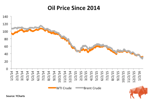
The conventional wisdom is that energy fund returns and oil price movements go hand-in-hand. Since the beginning of 2014, oil prices have fallen 70% and they have tumbled 50% from where they were just since the end of Q2 2015. Does this mean that energy funds are destined for a similar decline?

Our Q3 2015 performance information is still coming in and Q4 data is a few months away. Therefore, I turned to our fund and cash flow data to determine whether or not the 50% fall in oil prices will mean energy-focused funds should expect a similar drop-off. Using regression analysis, I compared the quarterly energy fund returns to both the quarterly returns of WTI crude and the broader Energy Price Index maintained by the World Bank.

Is There A Link Between Energy Funds and Oil Prices?

WTI Crude Analysis

I used our Bison funds to analyze the cash flows of 93 energy-focused private equity funds with vintage years between 2001 through 2013. These funds represent a little more than $160 billion of committed capital to the sector during this time. I grouped the funds into a portfolio and ran a simple regression analysis of the quarterly time-weighted returns against the quarterly returns of WTI crude oil.

Oil Price vs Returns

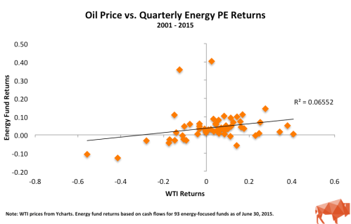
The scatter plot appears to show some correlation between oil prices and energy fund returns but the relationship (R-squared) is weak. R-squared values below 0.5 are generally not considered strong and a value of 0 indicates no relationship. Part of the reason for the low R-squared are the two noticeable outliers. These are from Q4 2004 and Q2 2005 and both instances can be attributed to large valuation increases in First Reserve IX and Carlyle/Riverstone Global Energy and Power Fund II. If you excluded these quarters from the analysis, the R-squared jumps to 0.296 – a 4x increase but still well below a value that is considered meaningful.

Energy Price Index Analysis

The Energy Price Index is a weighted average of global energy prices maintained by the World Bank. Specifically, the index is weighted as follows: Oil – 84.6%, Natural Gas – 10.8%, and Coal – 4.7%. During the second half of 2015, this index experienced a decline similar to WTI oil prices, falling 37%. I used this broader measure to see whether a more comprehensive index may show a stronger correlation with energy fund returns.Energy Price Index vs Returns

Similar to the comparison against the WTI oil price, the scatter plot appears to show a correlation but the R-squared of 0.092 indicates that the relationship is not strong.

Why Is the Correlation Weak?

There are likely a number of reasons why energy fund returns may not be entirely correlated to oil prices. Major variables include:

  • Initial purchase price
  • Debt levels
  • The presence of hedging contracts
  • Diversity of business’s operations
  • Portfolio diversification over several years
  • Insufficient sample size (n = 56, which covers 14 years of quarterly data)

The first four considerations could indicate why a company could performs independent of oil prices. Portfolio diversification would be the GP’s attempt to invest in companies over several years which should mean they are investing in companies at different points in the energy price cycle.  Another possibility is that the sample size is not large enough to be meaningful. A sample size greater than 100 is generally considered meaningful.

If oil prices aren’t the answer, could the reality be that energy fund returns are related more to their buyout fund brethren than to oil? Going back to our Bison funds, I ran a simple regression analysis of quarterly energy fund returns against a portfolio of 402 North American and Global buyout funds, excluding energy funds, from 2000 – 2013.

Buyout vs. Energy Returns

As the chart above shows, the R-squared of 0.433 is much higher than 0.066 – the R-squared of oil and energy funds’ returns. This R-squared is still below the meaningfulness threshold of 0.5 but this could indicate that energy private equity fund returns have a closer relationship to buyout funds than they do to energy prices.

Wrapping Up

Make no mistake, the steep decline in energy prices will negatively impact energy fund returns in Q3 and Q4 2015. However, the analysis above highlights that the price of energy is not the only factor, and may not even be the primary factor, that contributes to the energy fund returns.

How Do GPs Calculate Net Asset Value?

by Michael Roth

For funds that are not fully exited, the net asset value (“NAV “) is the primary component of its total value. This means the NAV plays a critical role in determining a fund’s performance metrics (TVPI multiple and IRR). It is the sum of each portfolio company’s NAV and these values are determined by the GP. As a result, it is important to understand how a GP values their portfolio companies and the accounting standards that guide this process.

At the gross cash flow level, this includes the value of the GP’s equity ownership stake in each portfolio company that has not been sold. At the net cash flow level, this includes: (1) the value of the GP’s equity ownership stake in each portfolio company that has not been sold and (2) the amount of carried interest that has been accrued by the manager given the fund’s current value.

Technically speaking there is a hierarchy, broken up into three levels, that GPs must follow when they value companies. The hierarchy below has been paraphrased from the FASB’s “Fair Value Measurements and Disclosures (Topic 820)”:

Level 1 –  Investments must be valued using objective, observable, unadjusted quoted market prices for identical investments in active markets on the measurement date, if available.

Level 2

  1. Objective, observable quoted market prices for similar investments in active markets.
  2. Quoted prices for identical or similar investments in markets that are not active.
  3. Inputs other than quoted prices that are observable for the asset.
  4. Inputs that are derived principally from or corroborated by observable market data by correlation or other means.

Level 3 – Subjective unobservable inputs for the investment where markets are not active at the measurement date. Unobservable inputs reflect the firm’s own assumptions about the assumptions that market participants would use in pricing the investment and should be developed based on best information available under the circumstances. The entity’s own data shall be adjusted if information is reasonably available without undue cost and effort that indicates that market participants would use different assumptions.

In short, the majority of private equity portfolio companies are considered “Level 3” assets because they are illiquid assets that are only valued on a quarterly basis. As a result, companies can be valued by using a combination of factors that are ultimately subject to the GP’s discretion. The exception to this “rule” is when a GP exits a company via the public markets and holds publicly listed stock. Those assets will be “Level 1” assets.

A Deeper Dive into Level 3 Assets

Since there is considerable leeway with valuing Level 3 assets, I will discuss the most common methodologies used by GPs: industry comparables, precedent transactions, and the discounted cash flow (“DCF”) method.

Industry Comparables Method

The industry comparables method seeks to find publicly listed companies whose business operations either fully or partially match the business operations of the company being evaluated. Comparable companies are initially filtered by geography and sector. From there, GPs will look to narrow down the peer set further using either revenue, EBITDA or enterprise value (“EV”) metrics. For example, if I am valuing a company with an EV of $300 million, it is more appropriate to compare it to companies of a similar size rather than a company that has an EV of $4 billion.

Once GPs have a comp set, they will find the average EV/EBITDA multiple and use that multiple as the basis for valuing their company. Depending on company metrics, GPs may make adjustments to the multiple higher or lower. Factors that could impact this include higher (or lower) historical revenue or EBITDA growth, higher (or lower) forecasted revenue or EBITDA growth,  higher (or lower) EBITDA margins, higher (or lower) debt levels, and company size relative to the comps. These are the most common factors and offer a sense of possible areas where subjectivity could come into play.

Precedent Transactions Method

Precedent transactions are recent acquisitions that have occurred of similar companies. GPs will use the valuation metrics (EV/EBITDA or EV/revenue) to value their companies. This data can be difficult to find and is often limited to transactions of public companies. The other common issue with this method is that valuation information is often stale because precedent transactions occurred several years earlier when market conditions were different. Generally speaking, precedent transactions that have occurred within in the last year are considered to be valid data points.

DCF Method

The discounted cash flow methodology uses a GP’s cash flow model to estimate the company’s value. This is the most subjective method and has a tendency to be viewed with skepticism whenever it is used. That is because you are relying on the GP’s estimates for a large number of inputs, including revenue growth, EBITDA growth, and EV/EBITDA multiples and the discount rate. A slight adjustment to any one of these factors could have a meaningful impact on a company’s valuation.

When a GP uses a DCF model to value a company, it is important to understand why they are doing this and what assumptions they are using. At Bison and from my prior fund of funds days, I have not seen a DCF model used by itself very often. Sometimes, a GP will use this alongside the industry comparables methodology. In this situation, they will assign a weighting (ex. 50/50 or 75/25) to the valuation generated by the industry comps method and the DCF method.

Wrapping Up

Knowing how a GP calculates the NAV helps inform your opinion about the validity of the fund’s performance metrics but it can also offers insights into the GP’s character – are they fair and honest; do they have a tendency to be aggressive; or maybe they are slow to adjust to a changing situation. From an LP perspective, make sure to ask the right questions – how and why are you valuing your companies in this way? From a GP’s perspective, make sure that you are consistent and transparent about your valuation process. Nothing raises red flags more than dramatically changing your methodology or shrouding your process in secrecy.

What are Recallable Distributions?

by Michael Roth

A recallable distribution is a distribution to LPs that GPs have the right to call again for the purpose of investing. This is a term that gets negotiated at the time of the fund’s formation. There are two primary situations where recallable distributions come into play:

  1. A GP will receive a distribution from a portfolio company within a short period of time (typically 12 or 18 months depending on the fund’s terms) and then use, some or all, of those proceeds to make a new investment.
  2. A GP will distribute capital to LPs that is the result of calling more capital than is necessary for an investment. This is commonly referred to as a return of excess capital called. [UPDATE – I received feedback from industry participants and some clarification from the CFA Institute, which leads me to believe that these should not be considered/treated like recallable distributions but rather should be treated like a reduction in capital called.]

From a fund cash flow perspective, these are the important points to remember:

  • The recallable distribution should be included as a distribution in the cash flows.
  • The amount that gets reinvested should be included as a contribution in the cash flows.
  • The amount that gets labelled a recallable distribution gets added back to the amount of unfunded capital that has yet to be called.

From an analysis standpoint, LPs need to be able to gauge how much money a GP returned on the entire amount of capital that is called. However, there are two schools of thought regarding how to calculate performance metrics given the presence of recallable distributions.

“All in method” – Calculate the TVPI multiple using the guidelines stated above where recallable distributions are classified as distributions and the amount that gets re-invested is classified as a capital contribution.

Screen Shot 2017-03-29 at 4.39.03 PM

“Recallable Distribution Excluded method” – Subtract the recallable distribution amount from the capital contribution and distribution side. Calculate the TVPI multiple using these smaller net numbers. Based on our investor data, we can see there are several large consultants who prepare their data in this manner.

Screen Shot 2017-03-29 at 4.38.51 PM

Bison recommends using the “all in method” as the true measure of a manager’s investment acumen. Using the “All in method” will produce lower performance multiples while the exclusion method will be more favorable to GPs.  To see how each methodology impacts the DPI and TVPI multiples, I have calculated the metrics for both methods using Apollo VII as an example. Using cash flow data from investors we track, I deduced an approximation of the recallable distribution amount.

Recallable Distributions

As the figure shows, the DPI and TVPI ratios are dramatically different because the recallable distribution amount of $5.8 billion is subtracted from the contributions and the distributions in Scenario B. This results in a TVPI multiple calculated as follows:

25,279,353,682 / 11,741,200,000 = 2.15

The point of scenario B is to highlight the benefit of recycling, which is really a fund management skill as opposed to an investment skill. From an LP perspective, any amount invested above and beyond their original commitment should benefit the LP. However, Scenario B’s calculations can be confusing and muddle the actual fund statistics.

Instead of using Scenario B, a more logical way to showcase the benefits of the recycling and proactive cash management would be to highlight the PIC ratio in addition to the DPI and TVPI multiples. The PIC ratio is defined as Paid In Capital / Committed Capital and it tells you how much of the fund has been invested. In the example above, Apollo VII has a PIC ratio of 1.2, meaning they have invested 20% more than LPs committed. You can illustrate recycling’s positive impact by multiplying the PIC ratio by the TVPI multiple. The equations below show how this method generates a more logical result than what occurs in Scenario B.

TVPI * PIC Ratio = Net Fund Multiple

⇒ 1.77 * 1.2 = 2.12

Total Value / Fund Size = Net Fund Multiple

⇒ 31,091,491,084 / 14,676,500,000 = 2.12

In summary, the way you treat recallable distributions can have a major impact on your performance metrics. Bison recommends using the “all in” approach as it is a fair and full representation of a manager’s performance. At the same time, we encourage managers to highlight the benefits of their proactive fund management skills by showing the fund’s ultimate returns as a result of a PIC ratio greater than 1.0.

Understanding Private Equity Cash Flows

by Michael Roth

From our experience working with 100s of participants on both sides of the market, there are lingering uncertainties and varying interpretations about how best to prepare and analyze cash flows. Our goal is to help GPs and LPs build and present cash flows in a consistent manner.

In the discussion below and subsequent pieces, I will detail how we at Bison think about cash flows and what we believe should be the industry standard. Our thinking closely aligns with the CFA Institute’s Global Investment Performance Standards (“GIPS”) and their Guidance Statement of Private Equity.

Read the rest of this entry »

Should Private Equity Fees and Carried Interest be Changed?

by Michael Roth

The media has made a big deal recently about private equity fees due to the revelations that CalPERS and CalSTRS have not kept track of the fees paid and carried interest earned by their private equity managers. More broadly, there is an increasing effort by LPs to receive greater disclosure about fees and reduce expenses.

My concern is that, in most cases, the focus on fees overlooks the real question: Do private equity returns justify the amount paid in fees and carry?

In this post, I will analyze the management fees paid to private equity managers but also look at them in the context of returns generated. Good returns should be rewarded but perhaps the conditions for receiving carried interest should be revisited.

Public Equity and Private Equity Fees Are Structured Differently

Private equity fees are frequently criticized as being outrageous in relation to their public market mutual fund peers. The glaring problem with this comparison is that mutual funds and private equity funds charge their fees on a different base. Private equity funds charge a 1.5 – 2% fee on commitments during the 5 year investment period. Thereafter, funds typically charge .75 – 1.25% of net asset value. Mutual funds charge an ad valorem fee, meaning the fee is charged on the fund’s NAV. As the fund’s value increases, your management fee, in absolute terms, goes up.

To get a sense for the cost of management fees, I chose to compare Carlyle Partners IV to an index fund, a large cap mutual fund, and a small cap mutual fund. These three mutual funds will highlight the impact of fees at the different fee levels.

Chart 1

Clearly, an index fund charges a fraction of the cost of a mutual fund or a private equity fund. However, if you have an investment mandate to earn returns in excess of the market, you are not going to choose an index fund. The more interesting comparisons are the large cap and small cap mutual funds against Carlyle IV. Just glancing at the numbers, it appears that Carlyle Partners IV is charging more than twice as much as Fidelity and 21% more than Putnam’s fund.

Fees Need to be Viewed on an “Apples to Apples” Basis

Critics inaccurately condemn private equity because they just look at the headline number. Let’s compare the cost of fees over a 10 year period to evaluate the true cost over the typical private equity fund’s life. For the three mutual funds, I used their 10 year returns in my assumptions to calculate the average fee over time.

Chart 2

For Carlyle IV, I assume the fees are the same as what they are for their more recent flagship funds. I use the fund’s actual NAVs, based on Bison’s cash flow data, to determine the post-investment period fees.

Over the 10-year span, Carlyle IV’s fees were just 6% more than Fidelity’s fund but were 40% LESS than Putnam’s fund. When an accurate comparison is done, private equity management fees do not look nearly as egregious as headlines may lead you to believe.

You Must Consider Returns

The question I asked at the beginning was whether or not private equity returns justify the amount paid in fees and carry?

To answer this question I looked at returns in two ways. First, I performed a simple analysis which calculated a TVPI multiple for the public market funds using their 10-year average annual return.

Chart 3

Using the 10-year CAGR for the three mutual funds, I arrived at each investment’s value after ten years. The TVPI multiple is equal to End Value / Commitment. Despite an average management fee that was 6% higher AND a 20% incentive fee, Carlyle IV managed to generate 13.6% more value than Fidelity’s fund. In the case of Putnam’s fund, Carlyle IV outperformed the fund while costing almost $700,000 less than in management fees.

This comparison is not completely relevant for analyzing a private equity manager because it ignores the PE manager’s ability to manage the cash flows. To account for this, I performed a PME analysis against the S&P 500 Total Return Index. The analysis tells a compelling story about the differential between Carlyle IV and the public markets.

Chart 4

Buying and selling the S&P 500 Total Return Index at the same times as Carlyle IV would have resulted in a 1.22x TVPI multiple and a 3.65% net IRR.

For those who think I may have selected a very convenient example to illustrate my point, I would refer you to my last piece, which analyzed the PME performance of North American and Global private equity funds. In nine of thirteen vintage years, buyout funds outperformed the Russell 2000. Digging into a fund level analysis, 52% of buyout funds analyzed outperformed the Russell 2000.

Carried Interest Hurdles Rates Should be Changed

When a fund’s returns are good, their fees look justified but what can you do when the returns are poor? Private equity gets it right by structuring the fees to have an incentive component. It is hard to justify Putnam earning 1.7% on average over the last 10 years given that they have returned just 6.2% annually.

Despite the conditional nature of carried interest, there is still an outcry over their payment. Part of this is partisan political beliefs that will never be satisfied but part of it is due to insufficient hurdle rates. There is a mismatch between the return expectations LPs place on themselves and the GPs. Internally, many LPs expect private equity to beat the public markets by 200 – 300 bps but they allow GPs to earn carried interest by generating an IRR greater than 8%. LPs should force GPs to meet the same return hurdles that they place on themselves.

Wrapping Up

Private equity fees are appropriately divided into management fees and carried interest. This ensures that managers are incentivized to maximize returns and not just accumulate assets. To ensure that incentives are completely aligned, the hurdle rate should be modified to acknowledge the link between public markets and private equity markets. Strong performance should be rewarded but that reward should include a condition that the manager generates excess returns over a market benchmark.

Here’s How To Use the Valuation Bridge

by Michael Roth

The valuation bridge is a valuable tool that both GPs and LPs can use to determine how and where “value creation” is coming from. In order to maximize the value of this analysis, it is important to understand what the valuation bridge tells you but also what it doesn’t tell you.

The valuation bridge identifies whether the total value of the fund has grown as the result of revenue growth, margin improvement, multiple expansion, or paying down debt.

Revenue growth and margin improvement, together, are the drivers of EBITDA growth.

  • Revenue Growth – Revenue growth is the proportion of equity growth that can be attributed solely to revenue from the time of investment to the most recent/exit date. A positive number means the company has been able to execute on its growth strategy.
  • Margin Improvement – Margin Improvement is the proportion of equity growth that can be attributed to the change in EBITDA margins from the time of investment to the most recent/exit date. A positive number means the company has been able to improve its operational efficiency and earn more of its revenue as EBITDA.

Multiple expansion is the proportion of equity growth that can be attributed to the change in the Enterprise Value / EBITDA multiple from the time of investment to the most recent/exit date. A positive number means the Firm was able to “buy low and sell high”. What an investor needs to determine is whether this is due to:

    • Growth and/or operational improvements that make the company more attractive than its peers or
    • Stock picking that is primarily due to market timing.

Fundamentally improving the company is the preferred source of multiple expansion. This is because it is more repeatable than timing the markets.

Debt Paydown is the proportion of equity growth that can be attributed to the change in net debt (total debt minus cash). A positive number means a company has reduced their net debt, which may be due to paying down debt or an increase in cash.

Other is frequently referred to as the “combination effect”. It aggregates the combined effects of EBITDA Growth (Revenue growth and margin improvement) and Multiple Expansion.

The valuation bridge does not tell you whether the portfolio companies outperformed the markets.

The valuation bridge does a good job dissecting the sources of equity growth. What is does not tell you is whether a company’s operational changes were better or worse than the public markets. This is important because viewing the operational changes in isolation does not tell you whether a manager added value or whether the portfolio companies benefitted from overall market trends.

This is why we developed the Market Bridge. Over the course of a fund’s life, a private equity manager earns a management fee of 1.5% – 2.0% during the investment period (first three to five years) and 1.0% – 1.5% during the remainder of the fund’s life. This is well above the average fee paid on an index mutual fund. Our Market Bridge allows user to determine whether GPs are actually earning their premium fees by adding value in excess of public market peers or just benefitting from financial engineering and/or market timing.

Closing Thoughts

The valuation bridge provides a powerful summary of the sources of value creation. However, the valuation bridge, viewed in isolation, does not identify whether a manager is truly adding value. If a GP invested in J. Crew, the valuation bridge will tell me how they created value and the Market Bridge will tell me if they added value in excess of their retail sector peers over the course of the investment.

Unicorns And The Next Venture Capital Crash

by Michael Roth

You can tell the VC industry is hot because there have been a plethora of articles and blog posts discussing the industry. In two parts, I will highlight the impact unicorns have had on the venture capital industry. They have undoubtedly rejuvenated the industry but evidence of excess is becoming more apparent.

To get a sense of where we are now, consider these stories:

  • The 10 largest unicorns have raised $15.6 billion from 137 investors, according to Crunchbase.
  • 71% of companies that went public in 2014 had no earnings.
  • 16 venture-backed companies have raised capital at a $1 billion valuation so far in 2015.
  • Firstmark raised $200 million for Pinterest’s latest round of financing ($11 billion valuation) from seven investors in three days.

And everyone knows Uber. The company is a juggernaut but its ascendance highlights several of venture capital’s issues, including aggressive growth assumptions and return expectations and the prevalence of “me too” companies.

One concern is how later stage investors are valuing the unicorns and what it means for return expectations.

Uber is reportedly valued at $41 billion and has raised $5.9 billion from 43 investors since 2011.

Based on rumors, Uber’s revenue growth has been explosive. It is believed they achieved $667 million in revenues in 2014 and they are projected to achieve $2 billion in revenues in 2015. That would be two successive years of 300% growth. Assuming a 25% EBITDA margin, that would give Uber an EV/EBITDA multiple of 82x based on 2015 projected EBITDA.

For those who invested in the early rounds, Uber has been and will be a great investment. For the later stage investors, like Foundation Capital, NEA and Qatar Investment Authority, how many more years of explosive growth are needed to generate an acceptable return for investors?

Another question some may ask is: How does this compare to public market valuations? Within the transportation industry, Uber’s valuation puts it in the same league as FedEx, which has an enterprise value of $52 billion.

FedEx has:

  • $47 billion in revenues  for the twelve months ended in February 2015.
    • 4.4% y-o-y
    • 3.8% over the last three years
  • $6.75 billion in EBITDA for the twelve months ended in February 2015.
    • 27% growth y-o-y
    • 8.6% over the last three years
  • EV/revenue multiple is 1.1x; EV/EBITDA multiple is 7.7x.
  • Intergrated Shipping & Logistics Industry Averages:
    • EV/EBITDA multiple – 10.6x.
    • EBITDA margin – 9.1%

Clearly, FedEx is a mature company whose growth rates do not come close to Uber’s. Still, the comparison puts a spotlight on how aggressively investors are currently pricing growth. Uber’s revenue and EBITDA are a fraction of FedEx’s but they are closing in on them from an enterprise value standpoint.

Another major concern is how will the unicorns generate liquidity.

This issue is closely tied to the previous concern regarding valuation. At a valuation of more than $1 billion, the unicorns are no longer little tuck-in acquisitions for corporate acquirers. This leaves the public markets as the likely exit route for many of the unicorns. However, late stage venture investors have been aggressively pricing the later rounds so that leaves less upside for public market investors.

If one too many of the unicorns disappoint in the public markets, investor sentiment can quickly turn negative and slam the IPO window shut for the rest of the unicorns.

The abundance of “me too” companies and their ability to receive funding is another symptom of market excess.

Have you heard of GetTaxi or Flywheel? They are mobile taxi apps that have raised $200 million and $35 million, respectively, since 2009.

Eager to have a portfolio company “in the space”, VCs provide more capital than is necessary to more companies than are feasible for an industry. Once the market becomes saturated, the end game for many companies turns into “let’s carve out a niche so one of the market leaders can acquire us” as opposed to “let’s provide innovation in a way that transforms an industry”.

The fierce competition in the mobile taxi app space is a prime example of this. The “Deal of the Day” space (Groupon, LivingSocial, etc.) is another good example as they experienced their boom and bust a few years ago.

Finally, one of the tell-tale signs of an inflated market is that investment discipline becomes less disciplined.

On more than one occasion, industry leaders, like Bill Gurley and Fred Wilson, have questioned the sustainability of the record high burn rates the industry is currently seeing. The answer to this seems to be, give them more capital!

According to the NVCA and PwC MoneyTree, annual venture capital investment exceeded $48 billion in 2014 – the highest amount since 2000. During 2014, there were more than 40 “megadeals” (investments exceeding $100 million) and two deals of more than $1 billion.

To reiterate those points,

  • The amount of capital invested into the industry is at the highest it has been since the last VC crash, and
  • There were more “megadeals” in 2014 than ever before.

A Look Ahead

In Part 2, I will discuss unicorns’ impact on fundraising, show how they result in high fund valuations and highlight the potential issues from an LP’s perspective.

Bison Open Benchmark

by goksor

Bison launches a new benchmark for private equity and venture capital. The benchmark is available for free at Bison.co as of today October 15, 2014. This new benchmark will help investors evaluate managers against peers and indicate institutional investors ability to pick winners.

Since launching in 2011, Bison has worked with institutional investors to collect performance data for private funds. Over 200 partners now contribute to the data set. Together, they provide ongoing updates on over 20,000 investments for 3,700 different funds in private equity and venture capital. Bison now has an open private equity data set where each source is visible.

The Bison benchmark will avoid many of the shortcomings for private equity benchmarks. Full transparency will help investors control for outliers among peers in the benchmark and also see number of known commitments to a fund. At the same time, where the Bison data comes directly from a variety of institutional investors, it includes both small and large funds, winners and losers, and a consistent core representation of funds. What is more, the Bison benchmark includes a unique view into how returns for different vintage years grow over time. This year-to-year measurement will help investors see if their managers are trending above or below the median for a vintage year.

“The industry has been looking for a new benchmark for a long time. An open benchmark will help investors like public pensions, endowments, and foundations understand their performance in the asset class, but also help the public see how well their money is being cared for,” says Michael Nugent, CEO, at Bison. He concludes, “We at Bison wants to make it easy for everyone to understand performance in private equity.”

Download our free private equity benchmark at www.bison.co.

The Problem With Long Nickels PME

by Michael Roth

Long Nickels was the industry’s first foray into comparing private equity to the public markets. At first glance, Long Nickels is intuitive, simple to execute, and its output is an IRR measure which is easily understood. This is likely why early results of our LP survey indicate Long Nickels is the most widely used PME methodology. Despite its widespread adoption, the Long Nickels calculation makes certain assumptions that need to be highlighted so investors understand why the calculation can be unreliable with typical private equity fund cash flows.

Read the rest of this entry »

IRR Can Be Useful – If You Know How To Use It

by Michael Roth

In our look at Investment Multiples, we dug deep into the various investment multiple metrics that are commonly used to evaluate fund performance. Alongside multiples, investors frequently consider the Internal Rates of Return (“IRR”) to get a complete view of a fund’s performance. The CFA Institute also requires funds to report the since inception IRR, along with the DPI, RVPI, and TVPI. In this post, I will detail the IRR formula and point out some well known shortcomings with IRR, but also argue that IRR can be a powerful tool in the right situation. Read the rest of this entry »