Bison

Industry intelligence that matters

Category: Private Equity Performance

What Does Public Market Equivalent (“PME”) Analysis Tell Me?

by Michael Roth

Now that you have chosen the methodology and index, it’s time to interpret the results. Whether it’s a peer benchmark or PME analysis, the important story to tell is not the snapshot (a single quarterly datapoint) but the trend. One year provides more context but we think a three year view offers a clearer picture of how a fund or fund family is performing against the public markets.

PME Blog piece

In the above example, I plotted the North American All PE IRR against the Bison PME IRR for the Russell 3000 index. If I were a GP presenting this as my fund’s PME analysis, there are several key points that I would emphasize with LPs.

  • My fund is outperforming the public markets by 3.2% through Q3 2015.
  • My fund has averaged 3.1% PME alpha over the last three years.
  • The markets have had a strong run over the last few years but our fund’s PME alpha never dipped below 2%.

Wrapping Up

PME analysis is here to stay as an LP analysis tool. Whether a GP is fundraising or performing their quarterly investor relations responsibilities (quarterly reports and quarterly update calls with LPs), it is important for GP’s to be knowledgeable about PME. A good IR team should have the answers to the questions discussed above. More importantly, they will have a well-crafted message that emphasizes the fund’s strengths.

Which Index Do I Choose for Public Market Equivalent (“PME”) Analysis?

by Michael Roth

In part 1, I addressed the question of which PME method to use. In this piece, I will discuss “best practices” for choosing an index.  This is undoubtedly a question that will be asked by sophisticated LPs. A GP’s answer will reveal how knowledgeable and in tune they are when it comes to LP concerns. When an LP is running a PME analysis against a GP’s net performance they are evaluating the opportunity cost of allocating money to private equity versus public equity.

To learn more about LP preferences, we surveyed 150 of the largest public pension funds in the United States to find out what they use as their private equity benchmark. Eighty-six disclosed their benchmark and we plotted the responses that show up more than once below.Public Pension PE Benchmark

More than two-thirds (59) use a public market index as their private equity benchmark and 70% of those LPs (43) use a broad public market index. The most popular index is the Russell 3000, which tracks the performance of the 3000 largest publicly listed companies in the United States.

In the last piece, I will address how to think about PME in the context of fund performance and how LPs are using it.

Which Public Market Equivalent (“PME”) Method Should I Choose?

by Michael Roth

Outperforming the public markets and the ability to speak intelligently about public market equivalent (“PME”) analysis is becoming a necessity in a GP’s investor relations conversations with LPs. Being unfamiliar with PME or saying “We don’t do PME” reveals a lack of sophistication and/or an indifference towards LP considerations. A GP needs to know the answers to questions like:

  • Which PME method do you use?
  • Why did you choose that index?
  • What does PME analysis tell me?

I will dig in to each question in their own blog post, starting with which PME should I use.

Choosing a PME Method

We know of eight different PME methodologies. We understand the nuances and can walk through the specifics of each one. Frankly, the index IRRs of each methodology are often within 1% – 2% of each other. Despite this close proximity, we are partial to our own methodology, Bison PME. Why?

  • Bison PME can be calculated in any situation
  • It is the least prone to the shortcomings associated with the IRR calculation
  • It is the most stable methodology

What do these points mean? In the image below, I have plotted the Russell 3000’s IRR using four different PME methods. For this analysis, I randomly selected 100 funds from our Bison funds dataset and sorted them by the Bison PME IRR. The Bison PME IRR for each fund is as of Q3 2015. April 2016 PME Comparison

The illustration shows that  GEM IPP and Direct Alpha are frequently in line with Bison PME. Meanwhile, Long Nickels shows that it is not a reliable PME methodology since it is frequently the outlier.

In the next piece, I will discuss how to choose a PME index.

Will Oil’s Decline Crush Energy PE Funds

by Michael Roth

Oil Prices

The conventional wisdom is that energy fund returns and oil price movements go hand-in-hand. Since the beginning of 2014, oil prices have fallen 70% and they have tumbled 50% from where they were just since the end of Q2 2015. Does this mean that energy funds are destined for a similar decline?

Our Q3 2015 performance information is still coming in and Q4 data is a few months away. Therefore, I turned to our fund and cash flow data to determine whether or not the 50% fall in oil prices will mean energy-focused funds should expect a similar drop-off. Using regression analysis, I compared the quarterly energy fund returns to both the quarterly returns of WTI crude and the broader Energy Price Index maintained by the World Bank.

Is There A Link Between Energy Funds and Oil Prices?

WTI Crude Analysis

I used our Bison funds to analyze the cash flows of 93 energy-focused private equity funds with vintage years between 2001 through 2013. These funds represent a little more than $160 billion of committed capital to the sector during this time. I grouped the funds into a portfolio and ran a simple regression analysis of the quarterly time-weighted returns against the quarterly returns of WTI crude oil.

Oil Price vs Returns

The scatter plot appears to show some correlation between oil prices and energy fund returns but the relationship (R-squared) is weak. R-squared values below 0.5 are generally not considered strong and a value of 0 indicates no relationship. Part of the reason for the low R-squared are the two noticeable outliers. These are from Q4 2004 and Q2 2005 and both instances can be attributed to large valuation increases in First Reserve IX and Carlyle/Riverstone Global Energy and Power Fund II. If you excluded these quarters from the analysis, the R-squared jumps to 0.296 – a 4x increase but still well below a value that is considered meaningful.

Energy Price Index Analysis

The Energy Price Index is a weighted average of global energy prices maintained by the World Bank. Specifically, the index is weighted as follows: Oil – 84.6%, Natural Gas – 10.8%, and Coal – 4.7%. During the second half of 2015, this index experienced a decline similar to WTI oil prices, falling 37%. I used this broader measure to see whether a more comprehensive index may show a stronger correlation with energy fund returns.Energy Price Index vs Returns

Similar to the comparison against the WTI oil price, the scatter plot appears to show a correlation but the R-squared of 0.092 indicates that the relationship is not strong.

Why Is the Correlation Weak?

There are likely a number of reasons why energy fund returns may not be entirely correlated to oil prices. Major variables include:

  • Initial purchase price
  • Debt levels
  • The presence of hedging contracts
  • Diversity of business’s operations
  • Portfolio diversification over several years
  • Insufficient sample size (n = 56, which covers 14 years of quarterly data)

The first four considerations could indicate why a company could performs independent of oil prices. Portfolio diversification would be the GP’s attempt to invest in companies over several years which should mean they are investing in companies at different points in the energy price cycle.  Another possibility is that the sample size is not large enough to be meaningful. A sample size greater than 100 is generally considered meaningful.

If oil prices aren’t the answer, could the reality be that energy fund returns are related more to their buyout fund brethren than to oil? Going back to our Bison funds, I ran a simple regression analysis of quarterly energy fund returns against a portfolio of 402 North American and Global buyout funds, excluding energy funds, from 2000 – 2013.

Buyout vs. Energy Returns

As the chart above shows, the R-squared of 0.433 is much higher than 0.066 – the R-squared of oil and energy funds’ returns. This R-squared is still below the meaningfulness threshold of 0.5 but this could indicate that energy private equity fund returns have a closer relationship to buyout funds than they do to energy prices.

Wrapping Up

Make no mistake, the steep decline in energy prices will negatively impact energy fund returns in Q3 and Q4 2015. However, the analysis above highlights that the price of energy is not the only factor, and may not even be the primary factor, that contributes to the energy fund returns.

Venture Capital Continues its Hot Streak

by Michael Roth

Bison’s June 30, 2015 final benchmarks were published last week. Using our cash flow dataset (“Bison funds”), we are able to analyze close to 1,300 North American private equity funds and identify industry trends.

Horizon IRR

The chart below illustrates the 1, 3, 5, and 10-year horizon IRRs for North American All PE, Buyouts, and Venture Capital / Growth Equity.

Q2 2015 Horizon IRRs

For the second consecutive quarter, the venture capital industry has a higher IRR over the 1, 3, and 5-year periods than the buyout industry. VC is still lagging buyouts on the 10-year horizon but it has narrowed the gap by 100 basis points over the last two quarters.

Time-Weighted Returns

The chart below looks at the returns for private equity and the public markets using an apples-to-apples time-weighted methodology.

Q2 2015 TWRR

Over the short-term and long-term, private equity is outperforming the public markets, represented here by the Russell 2000 and Russell 3000 total return indices. Similar to the horizon IRRs, venture capital is outperforming buyouts over the 1, 3, and 5-year periods. Over the 10-year period, buyouts are still outperforming venture capital by more than 200 basis points. Looking at the medium-term (3 and 5-year horizons), the public markets are outperforming through June 30, 2015. It will be interesting to see how these numbers hold up as of Q3 and Q4 2015.

Investment Activity

Investors are surely happy with the strong returns but they must also be pleased that GPs were busy selling assets and locking in gains. The chart below illustrates the ratio of distributions to contributions during each of the last four quarters. A ratio greater than 1.0 means there were more distributions than contributions in the quarter.

Dist vs. Calls

Both the venture capital and buyout industries saw their Distributions/ Contributions ratios jump in Q2 2015. Given how tumultuous the public markets were during the second half of 2015, it will be interesting to see how this ratio changes in Q3 and Q4. The surge in distributions is also notable for the VC industry because the inability to return money to investors has been an issue that I have highlighted before.


How Do GPs Calculate Net Asset Value?

by Michael Roth

For funds that are not fully exited, the net asset value (“NAV “) is the primary component of its total value. This means the NAV plays a critical role in determining a fund’s performance metrics (TVPI multiple and IRR). It is the sum of each portfolio company’s NAV and these values are determined by the GP. As a result, it is important to understand how a GP values their portfolio companies and the accounting standards that guide this process.

At the gross cash flow level, this includes the value of the GP’s equity ownership stake in each portfolio company that has not been sold. At the net cash flow level, this includes: (1) the value of the GP’s equity ownership stake in each portfolio company that has not been sold and (2) the amount of carried interest that has been accrued by the manager given the fund’s current value.

Technically speaking there is a hierarchy, broken up into three levels, that GPs must follow when they value companies. The hierarchy below has been paraphrased from the FASB’s “Fair Value Measurements and Disclosures (Topic 820)”:

Level 1 –  Investments must be valued using objective, observable, unadjusted quoted market prices for identical investments in active markets on the measurement date, if available.

Level 2

  1. Objective, observable quoted market prices for similar investments in active markets.
  2. Quoted prices for identical or similar investments in markets that are not active.
  3. Inputs other than quoted prices that are observable for the asset.
  4. Inputs that are derived principally from or corroborated by observable market data by correlation or other means.

Level 3 – Subjective unobservable inputs for the investment where markets are not active at the measurement date. Unobservable inputs reflect the firm’s own assumptions about the assumptions that market participants would use in pricing the investment and should be developed based on best information available under the circumstances. The entity’s own data shall be adjusted if information is reasonably available without undue cost and effort that indicates that market participants would use different assumptions.

In short, the majority of private equity portfolio companies are considered “Level 3” assets because they are illiquid assets that are only valued on a quarterly basis. As a result, companies can be valued by using a combination of factors that are ultimately subject to the GP’s discretion. The exception to this “rule” is when a GP exits a company via the public markets and holds publicly listed stock. Those assets will be “Level 1” assets.

A Deeper Dive into Level 3 Assets

Since there is considerable leeway with valuing Level 3 assets, I will discuss the most common methodologies used by GPs: industry comparables, precedent transactions, and the discounted cash flow (“DCF”) method.

Industry Comparables Method

The industry comparables method seeks to find publicly listed companies whose business operations either fully or partially match the business operations of the company being evaluated. Comparable companies are initially filtered by geography and sector. From there, GPs will look to narrow down the peer set further using either revenue, EBITDA or enterprise value (“EV”) metrics. For example, if I am valuing a company with an EV of $300 million, it is more appropriate to compare it to companies of a similar size rather than a company that has an EV of $4 billion.

Once GPs have a comp set, they will find the average EV/EBITDA multiple and use that multiple as the basis for valuing their company. Depending on company metrics, GPs may make adjustments to the multiple higher or lower. Factors that could impact this include higher (or lower) historical revenue or EBITDA growth, higher (or lower) forecasted revenue or EBITDA growth,  higher (or lower) EBITDA margins, higher (or lower) debt levels, and company size relative to the comps. These are the most common factors and offer a sense of possible areas where subjectivity could come into play.

Precedent Transactions Method

Precedent transactions are recent acquisitions that have occurred of similar companies. GPs will use the valuation metrics (EV/EBITDA or EV/revenue) to value their companies. This data can be difficult to find and is often limited to transactions of public companies. The other common issue with this method is that valuation information is often stale because precedent transactions occurred several years earlier when market conditions were different. Generally speaking, precedent transactions that have occurred within in the last year are considered to be valid data points.

DCF Method

The discounted cash flow methodology uses a GP’s cash flow model to estimate the company’s value. This is the most subjective method and has a tendency to be viewed with skepticism whenever it is used. That is because you are relying on the GP’s estimates for a large number of inputs, including revenue growth, EBITDA growth, and EV/EBITDA multiples and the discount rate. A slight adjustment to any one of these factors could have a meaningful impact on a company’s valuation.

When a GP uses a DCF model to value a company, it is important to understand why they are doing this and what assumptions they are using. At Bison and from my prior fund of funds days, I have not seen a DCF model used by itself very often. Sometimes, a GP will use this alongside the industry comparables methodology. In this situation, they will assign a weighting (ex. 50/50 or 75/25) to the valuation generated by the industry comps method and the DCF method.

Wrapping Up

Knowing how a GP calculates the NAV helps inform your opinion about the validity of the fund’s performance metrics but it can also offers insights into the GP’s character – are they fair and honest; do they have a tendency to be aggressive; or maybe they are slow to adjust to a changing situation. From an LP perspective, make sure to ask the right questions – how and why are you valuing your companies in this way? From a GP’s perspective, make sure that you are consistent and transparent about your valuation process. Nothing raises red flags more than dramatically changing your methodology or shrouding your process in secrecy.

What are Recallable Distributions?

by Michael Roth

A recallable distribution is a distribution to LPs that GPs have the right to call again for the purpose of investing. This is a term that gets negotiated at the time of the fund’s formation. There are two primary situations where recallable distributions come into play:

  1. A GP will receive a distribution from a portfolio company within a short period of time (typically 12 or 18 months depending on the fund’s terms) and then use, some or all, of those proceeds to make a new investment.
  2. A GP will distribute capital to LPs that is the result of calling more capital than is necessary for an investment. This is commonly referred to as a return of excess capital called. [UPDATE – I received feedback from industry participants and some clarification from the CFA Institute, which leads me to believe that these should not be considered/treated like recallable distributions but rather should be treated like a reduction in capital called.]

From a fund cash flow perspective, these are the important points to remember:

  • The recallable distribution should be included as a distribution in the cash flows.
  • The amount that gets reinvested should be included as a contribution in the cash flows.
  • The amount that gets labelled a recallable distribution gets added back to the amount of unfunded capital that has yet to be called.

From an analysis standpoint, LPs need to be able to gauge how much money a GP returned on the entire amount of capital that is called. However, there are two schools of thought regarding how to calculate performance metrics given the presence of recallable distributions.

“All in method” – Calculate the TVPI multiple using the guidelines stated above where recallable distributions are classified as distributions and the amount that gets re-invested is classified as a capital contribution.

Screen Shot 2017-03-29 at 4.39.03 PM

“Recallable Distribution Excluded method” – Subtract the recallable distribution amount from the capital contribution and distribution side. Calculate the TVPI multiple using these smaller net numbers. Based on our investor data, we can see there are several large consultants who prepare their data in this manner.

Screen Shot 2017-03-29 at 4.38.51 PM

Bison recommends using the “all in method” as the true measure of a manager’s investment acumen. Using the “All in method” will produce lower performance multiples while the exclusion method will be more favorable to GPs.  To see how each methodology impacts the DPI and TVPI multiples, I have calculated the metrics for both methods using Apollo VII as an example. Using cash flow data from investors we track, I deduced an approximation of the recallable distribution amount.

Recallable Distributions

As the figure shows, the DPI and TVPI ratios are dramatically different because the recallable distribution amount of $5.8 billion is subtracted from the contributions and the distributions in Scenario B. This results in a TVPI multiple calculated as follows:

25,279,353,682 / 11,741,200,000 = 2.15

The point of scenario B is to highlight the benefit of recycling, which is really a fund management skill as opposed to an investment skill. From an LP perspective, any amount invested above and beyond their original commitment should benefit the LP. However, Scenario B’s calculations can be confusing and muddle the actual fund statistics.

Instead of using Scenario B, a more logical way to showcase the benefits of the recycling and proactive cash management would be to highlight the PIC ratio in addition to the DPI and TVPI multiples. The PIC ratio is defined as Paid In Capital / Committed Capital and it tells you how much of the fund has been invested. In the example above, Apollo VII has a PIC ratio of 1.2, meaning they have invested 20% more than LPs committed. You can illustrate recycling’s positive impact by multiplying the PIC ratio by the TVPI multiple. The equations below show how this method generates a more logical result than what occurs in Scenario B.

TVPI * PIC Ratio = Net Fund Multiple

⇒ 1.77 * 1.2 = 2.12

Total Value / Fund Size = Net Fund Multiple

⇒ 31,091,491,084 / 14,676,500,000 = 2.12

In summary, the way you treat recallable distributions can have a major impact on your performance metrics. Bison recommends using the “all in” approach as it is a fair and full representation of a manager’s performance. At the same time, we encourage managers to highlight the benefits of their proactive fund management skills by showing the fund’s ultimate returns as a result of a PIC ratio greater than 1.0.

Understanding Private Equity Cash Flows

by Michael Roth

From our experience working with 100s of participants on both sides of the market, there are lingering uncertainties and varying interpretations about how best to prepare and analyze cash flows. Our goal is to help GPs and LPs build and present cash flows in a consistent manner.

In the discussion below and subsequent pieces, I will detail how we at Bison think about cash flows and what we believe should be the industry standard. Our thinking closely aligns with the CFA Institute’s Global Investment Performance Standards (“GIPS”) and their Guidance Statement of Private Equity.

Read the rest of this entry »

The Horizon IRR Metric Keeps Being Misused

by Michael Roth

Accurately measuring performance and estimating asset class returns is the most important part of the asset allocation process. The reason it is important is two-fold: (1) return estimates have the biggest impact on your asset allocation model and (2) studies have shown that asset allocation is a critical component of returns.

Considering this, industry trade groups, like the BVCA, and service providers, like Cambridge Associates, continue to inappropriately tout a horizon IRR calculation in comparison to the public market’s 1,3, 5, or 10 year time weighted rate of return.

As I have discussed previously, it is a mistake to think an IRR and a time weighted return are one and the same. Both are annualized rates of return but they deal with cash inflows and outflows in different ways. IRR specifically accounts for the timing and size of cash flows when calculating the returns generated while the time weighted return specifically excludes the impact of cash flows and weights the returns in each time period equally. Each method has their shortcomings and ideal use cases. Take these metrics out of context and they can be misleading.

What difference does a return calculation make?

I used a portfolio of 481 North America and Global buyout funds from Bison’s cash flow dataset to analyze the difference between the horizon IRR and the time weighted return. Both return calculations were performed using quarterly cash flows. Read the rest of this entry »

Should Private Equity Fees and Carried Interest be Changed?

by Michael Roth

The media has made a big deal recently about private equity fees due to the revelations that CalPERS and CalSTRS have not kept track of the fees paid and carried interest earned by their private equity managers. More broadly, there is an increasing effort by LPs to receive greater disclosure about fees and reduce expenses.

My concern is that, in most cases, the focus on fees overlooks the real question: Do private equity returns justify the amount paid in fees and carry?

In this post, I will analyze the management fees paid to private equity managers but also look at them in the context of returns generated. Good returns should be rewarded but perhaps the conditions for receiving carried interest should be revisited.

Public Equity and Private Equity Fees Are Structured Differently

Private equity fees are frequently criticized as being outrageous in relation to their public market mutual fund peers. The glaring problem with this comparison is that mutual funds and private equity funds charge their fees on a different base. Private equity funds charge a 1.5 – 2% fee on commitments during the 5 year investment period. Thereafter, funds typically charge .75 – 1.25% of net asset value. Mutual funds charge an ad valorem fee, meaning the fee is charged on the fund’s NAV. As the fund’s value increases, your management fee, in absolute terms, goes up.

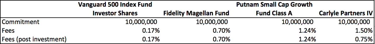
To get a sense for the cost of management fees, I chose to compare Carlyle Partners IV to an index fund, a large cap mutual fund, and a small cap mutual fund. These three mutual funds will highlight the impact of fees at the different fee levels.

Chart 1

Clearly, an index fund charges a fraction of the cost of a mutual fund or a private equity fund. However, if you have an investment mandate to earn returns in excess of the market, you are not going to choose an index fund. The more interesting comparisons are the large cap and small cap mutual funds against Carlyle IV. Just glancing at the numbers, it appears that Carlyle Partners IV is charging more than twice as much as Fidelity and 21% more than Putnam’s fund.

Fees Need to be Viewed on an “Apples to Apples” Basis

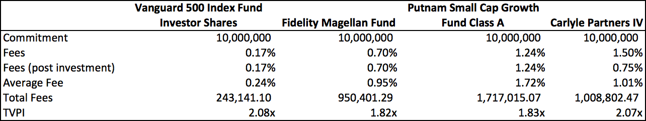
Critics inaccurately condemn private equity because they just look at the headline number. Let’s compare the cost of fees over a 10 year period to evaluate the true cost over the typical private equity fund’s life. For the three mutual funds, I used their 10 year returns in my assumptions to calculate the average fee over time.

Chart 2

For Carlyle IV, I assume the fees are the same as what they are for their more recent flagship funds. I use the fund’s actual NAVs, based on Bison’s cash flow data, to determine the post-investment period fees.

Over the 10-year span, Carlyle IV’s fees were just 6% more than Fidelity’s fund but were 40% LESS than Putnam’s fund. When an accurate comparison is done, private equity management fees do not look nearly as egregious as headlines may lead you to believe.

You Must Consider Returns

The question I asked at the beginning was whether or not private equity returns justify the amount paid in fees and carry?

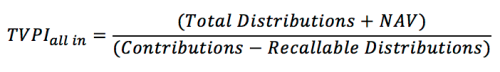
To answer this question I looked at returns in two ways. First, I performed a simple analysis which calculated a TVPI multiple for the public market funds using their 10-year average annual return.

Chart 3

Using the 10-year CAGR for the three mutual funds, I arrived at each investment’s value after ten years. The TVPI multiple is equal to End Value / Commitment. Despite an average management fee that was 6% higher AND a 20% incentive fee, Carlyle IV managed to generate 13.6% more value than Fidelity’s fund. In the case of Putnam’s fund, Carlyle IV outperformed the fund while costing almost $700,000 less than in management fees.

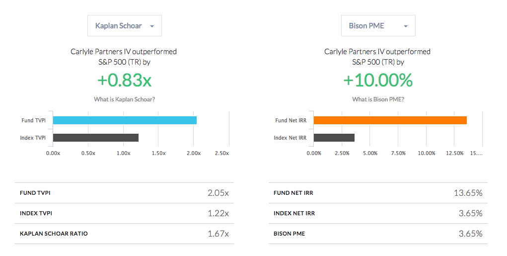
This comparison is not completely relevant for analyzing a private equity manager because it ignores the PE manager’s ability to manage the cash flows. To account for this, I performed a PME analysis against the S&P 500 Total Return Index. The analysis tells a compelling story about the differential between Carlyle IV and the public markets.

Chart 4

Buying and selling the S&P 500 Total Return Index at the same times as Carlyle IV would have resulted in a 1.22x TVPI multiple and a 3.65% net IRR.

For those who think I may have selected a very convenient example to illustrate my point, I would refer you to my last piece, which analyzed the PME performance of North American and Global private equity funds. In nine of thirteen vintage years, buyout funds outperformed the Russell 2000. Digging into a fund level analysis, 52% of buyout funds analyzed outperformed the Russell 2000.

Carried Interest Hurdles Rates Should be Changed

When a fund’s returns are good, their fees look justified but what can you do when the returns are poor? Private equity gets it right by structuring the fees to have an incentive component. It is hard to justify Putnam earning 1.7% on average over the last 10 years given that they have returned just 6.2% annually.

Despite the conditional nature of carried interest, there is still an outcry over their payment. Part of this is partisan political beliefs that will never be satisfied but part of it is due to insufficient hurdle rates. There is a mismatch between the return expectations LPs place on themselves and the GPs. Internally, many LPs expect private equity to beat the public markets by 200 – 300 bps but they allow GPs to earn carried interest by generating an IRR greater than 8%. LPs should force GPs to meet the same return hurdles that they place on themselves.

Wrapping Up

Private equity fees are appropriately divided into management fees and carried interest. This ensures that managers are incentivized to maximize returns and not just accumulate assets. To ensure that incentives are completely aligned, the hurdle rate should be modified to acknowledge the link between public markets and private equity markets. Strong performance should be rewarded but that reward should include a condition that the manager generates excess returns over a market benchmark.